Visitor Tracking
What This Guide Does — A Set Up Tracking walkthrough showing how to read the Visitor Tracking Overview and Events Explorer tabs.
Why It Is Useful — Tracking gives you a clear, ready-made picture of revenue, conversion, and user behavior, without needing a data team to build it.
How to Use It
Open Visitor Tracking
Use these filters to change the reporting period and access module settings.
Read the Overview KPIs
These cards summarize your main performance numbers at a glance.
Choose the Right Date Range
Select a start and end date, then select Apply to update all data.
Check Metric Details
Open any metric card to view its trend over time and see the top sources contributing.
Review the Conversion Funnel
See how users move through key stages and where drop-offs occur. Check the User Base to understand registration status.
Use Events Explorer
Switch to Events Explorer to analyze user activity by event type over time.
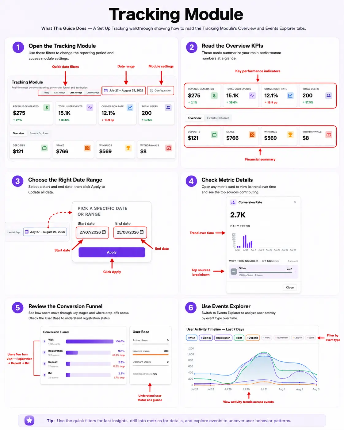
What You Should See — A dashboard that fills in with real numbers as visitors interact with your site, and a funnel that narrows at each stage from Visit down to Bet.
Tips
- Use the quick filters for fast insights, drill into metrics for details, and explore events to uncover user behavior patterns.
Notification Launcher Styling
The tracking SDK can place the notification bell inside your own header, menu, or action bar. Add one anchor where the bell should render:
<div data-nommos-notification-anchor></div>Then style the anchor or the exposed launcher parts from your site CSS:
.site-actions [data-nommos-notification-anchor] {
  color: #111827;
  display: inline-flex;
  align-items: center;
  justify-content: center;
}

.site-actions [data-nommos-notification-anchor] nommos-popup-launcher::part(launcher) {
  width: 44px;
  height: 44px;
  font-size: 24px;
  border-radius: 999px;
  background: transparent;
}

.site-actions [data-nommos-notification-anchor] nommos-popup-launcher::part(launcher):hover {
  background: rgba(17, 24, 39, 0.08);
}
Available styling hooks
| Selector | What it controls | Useful properties |
|---|---|---|
[data-nommos-notification-anchor] |
The empty slot you add to your page. | display, align-items, justify-content, gap, width, height, min-width, min-height, margin, padding, color, font-size, line-height |
nommos-popup-launcher::part(launcher-wrap) |
The wrapper around the injected bell button. | display, align-items, justify-content, margin, padding, position, top, right, bottom, left, z-index, transform |
nommos-popup-launcher::part(launcher) |
The bell button itself. | display, align-items, justify-content, width, height, min-width, min-height, padding, font-size, line-height, color, background, border, border-radius, box-shadow, opacity, cursor, outline, transform, transition |
Related Guides